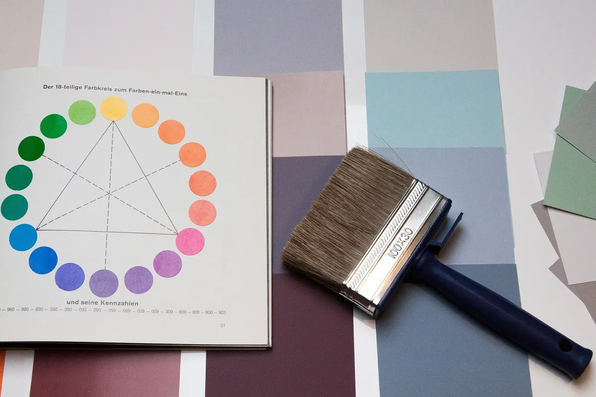
Common Mistakes When Choosing Paint Colors for North-Facing Rooms
North-facing rooms get a bad reputation, and most of it is earned — until the paint is right. The light that reaches a north window is indirect and carries a cool cast, so it flatters almost nothing on its own. Colors that looked soft and inviting in the store can turn chalky, gray, or distinctly blue on the wall. The fix is rarely one magic shade. It is a set of habits: reading undertones honestly, testing samples in the actual room, and accounting for what happens after sunset.
Mistake One: Choosing the Color Under Store Lighting
Store lighting is built to sell paint. Aisles are lit with bright, cool-leaning fluorescents and LEDs that push every color toward its cleanest, most vivid version. A warm white that reads creamy on the shelf can read icy on your walls. Paint chips have the same problem: they are small, glossy, and printed on paper rather than painted on drywall.
Skip the photo test too. Screens shift color, and someone else's north-facing room — different climate, different windows, different furniture — proves nothing about yours.
Mistake Two: Ignoring Undertones Until the Room Feels Cold
Every color carries an undertone, the secondary hue that surfaces when light is weak or indirect. In a north-facing room, undertones become the main event rather than a detail.
Cool whites and grays often lean blue, green, or violet. In this light, blue reads colder, green can go sour, and violet can look bruised. Warm undertones — red, yellow, orange, brown — hold their ground when light is scarce.
A few comparisons worth making with sample pots:
- Cool gray versus greige: a pure gray with a blue undertone turns into a rain cloud; a greige with beige warmth stays soft and lived-in.
- Icy white versus warm white: a white with a green undertone makes trim look dingy, while one with a hint of cream keeps the room crisp without feeling clinical.
- Blackened navy versus teal-leaning navy: deep colors need warmth here, so a navy with a green or teal edge usually feels richer than a flat, inky blue.
- Sage versus mint: both are green, but the gray-green sage holds up where the brighter mint goes thin and cold.
Mistake Three: Testing in the Wrong Spot, at the Wrong Time
Small samples lie. A two-inch square in the middle of a wall catches light differently than a large painted surface, and a sample judged at noon misses the hours when the room feels gloomiest.
Test like you mean it:
- Paint two coats on a board of foam core or scrap drywall, at least two feet by three feet, and leave a white border around the edges.
- Place one board on the wall beside the window and another on the wall opposite the window. Those two surfaces receive very different light.
- Look at both in the morning, at midday, in late afternoon, and at night with the lamps on. Notice when each one turns gray.
- Leave them up for a few days. If a color only works at 2 p.m., it doesn't work.
Test Beside Your Fixed Elements
Floors, wood trim, stone counters, and built-ins don't move, and they bounce light around the room. Warm oak flooring pushes a wall color warmer; gray tile pulls it cooler. Hold the boards next to those surfaces, not just against bare drywall.
Mistake Four: Overcorrecting With Aggressive Warmth
After a cold gray fails, the instinct is to swing hard: butter yellow, pumpkin, heavy gold. That flips the mistake instead of solving it. Under warm bulbs at night, too much yellow can turn mustard. A steadier correction is a warm neutral — a soft off-white, a greige with a red-brown undertone, a muted sage, a dusty clay — that adds heat without shouting.
Mistake Five: Forgetting the Room's Artificial Light
After dark, the lamps are the room. Cool white LEDs in the 4000K range and above will undo whatever warmth you built into the wall color, making everything look flat and bluish again. Warm bulbs in the 2700K to 3000K range suit most living spaces, and layering matters: a ceiling fixture, a floor lamp, and a couple of table lamps at different heights keep a north room from feeling shadowy once the sun is gone.
Judge a north-facing wall color by how it looks at eight in the evening, not by how it looks at noon.
Sheen counts as well. Flat paint absorbs light and softens a space; higher sheens bounce it back and expose every imperfection. In a low-light room, matte or eggshell walls with satin reserved for trim and kitchens is the combination most people end up preferring.
Mistake Six: Painting Everything the Same Shade
A north room painted one color from floor to ceiling with bright white trim rarely feels calm. It feels flat, because the eye has no contrast to follow. A ceiling a shade or two lighter than the walls, or a soft tinted white, gives the room somewhere to go. Treat trim as a deliberate choice rather than a default.
A Sequence That Actually Works
Start with the light, not the color. Spend a week noticing when the room is brightest, when it feels dull, and what the walls look like after dark.
Then pull three to five candidates and buy sample pots: a cool neutral, a warm neutral, and one bolder option. Paint the boards, place them on two walls, and check them morning, noon, evening, and under the lamps.
Narrow it to two. Look at each beside your floor and your main furniture, and through the doorway from the next room, since adjacent spaces affect perception more than most people expect. Then buy the one that looks good at its worst hour, not its best. That single test prevents most of the repainting that north-facing rooms are known for — and turns a room you tolerate into one you actually enjoy sitting in on a gray afternoon.
Photo: stux / Pixabay

Beginner's Guide to Slow Travel in Small Coastal Towns
A practical guide to slow travel in small coastal towns: how to choose a base, stay longer, spend locally,...

Checklist: Packing a Carry-On for a Weekend City Break in Shoulder Season
A practical carry-on packing list and three-layer strategy for a spring or autumn city break, so you can...
About Us